Last updated: 12 November 2026
- The five-part case study structure
- A full sample case study
- How many projects to include
- Fresher portfolio without clients: 3 project briefs
- Platform options
- Review checklist before you apply
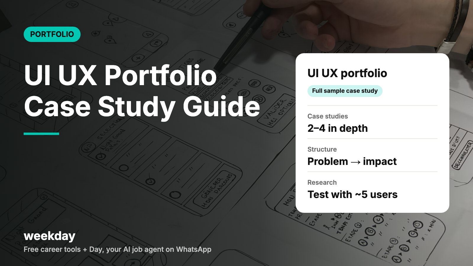
- Usability research by Jakob Nielsen found that testing with about 5 users uncovers roughly 85% of usability problems. Five interviews or tests is a credible fresher research sample.
- Hiring managers often skim a case study first. Aim for 3–5 minutes of reading per project, with a summary at the top.
- Behance, Dribbble, Figma, Framer and Notion all offer free plans; check current limits before you choose.
- WCAG, the web accessibility standard, recommends a contrast ratio of at least 4.5:1 for normal text. Reviewers notice low-contrast portfolios.
Sources: Nielsen Norman Group ("Why you only need to test with 5 users"); W3C WCAG 2.1; platform pricing pages.
Send your resume to Day, Weekday's free AI agent on WhatsApp. It turns it into a cleaner, website-style portfolio and finds jobs that fit, applying when you say yes.
Say hi to Day on WhatsAppHow Day works →The five-part case study structure
Every good UX case study answers one question: why did you design it this way? The five parts below make that answer easy to follow. Put a three-line summary at the top so a busy reviewer can stop there and still understand the project.
| Part | What to show | Length | Common mistake |
|---|---|---|---|
| 1. Problem | Who has the problem, how you know, and the goal | 60–100 words | Starting with "I redesigned X because it looked old" |
| 2. Research | Interviews, surveys, competitor review, analytics; 3–5 key insights | 100–200 words + 1 visual | Pasting raw notes or 20 sticky-note photos |
| 3. Process | Personas or jobs-to-be-done, flows, sketches, wireframes, decisions you dropped | 150–250 words + 2–3 visuals | Showing every artefact without explaining why |
| 4. Solution | Final screens with callouts linking each design choice to an insight | 100–200 words + 3–5 screens | A wall of mockups with no words |
| 5. Impact | Test results, metrics, feedback, what you'd do next | 60–120 words | Inventing numbers, or skipping this part |
Your role matters too. State it in the summary: solo project, or "I led research and wireframes; a teammate did visual design." Hiring managers will ask, so be clear upfront.
A full sample case study
Sample UX case study (fresher, self-initiated)
PROJECT: Making clinic appointment booking easier for older patients
Role: Solo (research, UX, UI, testing) · Time: 4 weeks · Tools: Figma, Google Forms, Maze-style unmoderated tests

SUMMARY
A neighbourhood clinic in Jaipur takes most bookings by phone. Patients over 55 found the clinic's web form confusing. I redesigned the booking flow. In tests with 6 users, task completion went from 3 of 6 to 6 of 6.

1. PROBLEM
The receptionist told me she spends about two hours a day on booking calls. The web form had 11 fields, a tiny date picker and no Hindi option. Goal: let a patient book a slot on a phone in under two minutes without help.

2. RESEARCH
- Interviewed 5 patients aged 55–72 and the receptionist.
- Reviewed 3 booking apps patients already used.
Key insights:
• Patients think in terms of "which doctor, which day", not "department".
• Small date pickers caused most errors.
• 4 of 5 wanted a confirmation they could forward to family on WhatsApp.
• Typing a full address felt unnecessary for a clinic visit.

3. PROCESS
- Mapped the old flow: 11 fields, 4 screens.
- Sketched 3 ideas: a chat-style flow, a calendar-first flow and a doctor-first flow.
- Dropped the chat-style flow after 2 users found it slow to scan.
- Built mid-fidelity wireframes for doctor-first, tested with 3 users, fixed 2 issues (unclear time slots, hidden back button).

4. SOLUTION
- Step 1: choose doctor (photo, name, speciality in plain words).
- Step 2: choose day from large buttons for the next 7 days.
- Step 3: choose a time slot; morning and evening grouped.
- Step 4: name and mobile number only. Hindi/English toggle on every screen.
- Confirmation screen with a "Share on WhatsApp" button.
Text at 18px minimum, buttons 48px tall, contrast checked against WCAG AA.

5. IMPACT
- Unmoderated test, 6 users aged 55+: 6/6 completed booking (old form: 3/6).
- Median time: 1 min 40 sec (old form: 4 min 10 sec).
- Fields reduced from 11 to 4.
The clinic has not built it yet, so there is no live data. Next I would test the Hindi copy with more users and design a reschedule flow.
What makes it work: a real user group, a small but honest sample, one idea dropped with a reason, and impact stated as test results, with a clear note that it isn't live. That honesty earns more trust than a made-up "conversions up 40%".
How many projects to include
| Profile | Case studies | Plus | Notes |
|---|---|---|---|
| Fresher / bootcamp graduate | 2–3 | 1 small visual or interaction piece | Depth beats volume |
| 1–3 years | 3 | Optional side project | At least one shipped, real project |
| 4–7 years | 3–4 | Short summaries of other work | Show scope: teams, systems, outcomes |
| Lead / manager | 2–3 deep ones | Notes on process, hiring, design systems | Show how you raised the team's quality |
If your work is under NDA, change names and numbers, blur sensitive screens and say so. "Details changed for confidentiality" is normal and accepted. Don't share anything your employer hasn't allowed.
Fresher portfolio without clients: 3 project briefs
You don't need clients. You need real problems and real users. Self-initiated projects are fine as long as you label them clearly and do actual research. Here are three briefs you can start this week.
Brief 1 (mobile app)
BRIEF 1: Metro or bus ticketing for first-time users
Users: people new to a city's metro, including older users and visitors.
Problem: buying a QR ticket in the app takes many steps and confuses first-timers.
Research: watch 5 people buy a ticket; note where they pause.
Deliverables: current-flow map, 2 alternative flows, prototype, test with 5 users.
Success measure: time to buy a ticket and number of errors.
Brief 2 (two-sided product)
BRIEF 2: Hostel or PG mess feedback tool
Users: students in a hostel and the mess manager.
Problem: feedback is shouted in WhatsApp groups and nothing changes.
Research: survey 20 students, interview the manager.
Deliverables: a simple weekly rating flow for students and a one-screen summary for the manager.
Success measure: would the manager use the summary? Test with the real manager.
Brief 3 (form and content design)
BRIEF 3: Redesign a government form you've filled yourself
Users: people applying for a common certificate or service online.
Problem: long forms, unclear errors, document uploads that fail.
Research: fill it yourself, then watch 5 others fill a mock version.
Deliverables: error-state redesign, upload flow, plain-language copy in English and one Indian language.
Success measure: fewer errors and faster completion in your tests.
Note: label it clearly as a self-initiated concept, not an official project.
Pick two briefs, do them properly, and add one small visual exercise (an icon set or a landing page) to show craft. That is a complete fresher portfolio. For layout ideas, browse our portfolio website examples.
Platform options
Choose the platform by how much you want to design the site itself. For UI roles, the portfolio site is part of the test, so a custom site helps. For UX research roles, clear writing matters more than the frame.
| Platform | What it is | Free plan | Best for | Watch out for |
|---|---|---|---|---|
| Behance | Adobe's creative showcase network | Yes | Visual case studies, discovery by other designers | Long scroll; add a summary at the top |
| Dribbble | Design shots and profiles | Yes, with paid upgrades | UI visuals and micro-interactions | Shots alone don't show process |
| Framer | Website builder with a design-tool feel | Free plan with limits | Custom, polished portfolio sites | Free plan shows branding; check current pricing |
| Notion | Docs that can be published as public pages | Yes | Fast, text-heavy UX research case studies | Looks plain unless you design the layout |
| Webflow / Wix / Squarespace | Website builders | Free or trial options vary | Full control over layout | More setup time |
| Day on WhatsApp | Weekday's free AI job agent | Free | Turning your resume into a website-style portfolio and finding roles | Add your case studies separately |
Many designers use two: Behance or Dribbble for discovery, and a personal site for applications. Day fits in alongside: it can turn your resume into a portfolio you can share with recruiters, and then find design roles on Weekday that fit, applying only where you say yes. For a wider comparison, see our guide to the best AI portfolio makers.
Review checklist before you apply
| Check | Pass when |
|---|---|
| Summary at the top of each case study | Someone can understand the project in 20 seconds |
| Your role is stated | Solo or team, and exactly what you did |
| Research is real | You can name how many users you spoke to and what you learned |
| Every visual has a caption | Each caption explains a decision, not just "Home screen" |
| Impact is honest | Test results or feedback; "not live" if it isn't |
| Readable on mobile | No tiny text in images; key screens zoomable |
| Contrast and type | Body text at least 16px; contrast about 4.5:1 or higher |
| Prototype links work | Opened in an incognito window, no access request |
| Resume matches | Same project names, dates and tools |
| Ask for a review | One designer and one non-designer read it and can explain it back |
How to send it to a recruiter
Sample email with portfolio link
Subject: Product Designer application – Neha Verma (portfolio inside)

Hi Priya,

I'm applying for the Product Designer role on your fintech app team. My portfolio has two case studies that match the role:

1. Clinic booking for older patients – task completion 3/6 → 6/6 in tests.
2. Hostel mess feedback tool – tested with a real mess manager and 20 students.

Portfolio: [link] · Resume attached.

I'd be glad to walk you through either in 15 minutes.

Thanks,
Neha
Getting interviews? Prepare for the portfolio walk-through: pick one project, tell it in five minutes using the same five parts, and expect "what would you do differently?". Our HR interview questions guide covers the rest of the round. If you also code, see the developer portfolio guide.
FAQs
What should a UI UX portfolio include?
2–4 case studies, each covering problem, research, process, solution and impact, plus a short about section, your resume and contact details.
How many projects should a UX fresher show?
Two or three case studies done in depth, plus one small visual piece. Depth matters more than the number.
Can I make a UI UX portfolio without client work?
Yes. Use self-initiated projects with real research, such as testing with 5 users, and label them clearly as concept projects.
What is the best structure for a UX case study?
A short summary, then problem, research, process, solution and impact. State your role and keep it readable in 3–5 minutes.
Is Behance or Dribbble better for a UX portfolio?
Behance suits longer case studies; Dribbble suits UI visuals. Many designers use one for discovery and a personal site for applications.
Can I use Notion for my design portfolio?
Yes, especially for research-heavy UX roles. It is quick to publish, though it looks plain unless you design the layout carefully.
Should I show metrics if my project isn't live?
Show test results, like task completion and time on task, and say clearly that it isn't live. Never invent business metrics.
How do I show work under NDA?
Change names and numbers, blur sensitive screens, say details were changed, and only share what your employer allows.
Can AI make my design portfolio?
AI tools can draft a layout from your resume. Day, Weekday's free AI agent on WhatsApp, can turn your resume into a website-style portfolio; your case studies still need your own thinking.
How long should a UX case study be?
Usually 600–1,200 words with visuals, so it takes 3–5 minutes to read. Put the summary first.